Enigma OS Documentation
Fully-configurable in-world control surface for VRChat
Project maintained by Cozen-Official Hosted on GitHub Pages — Theme by mattgraham
Advanced Features
Step Buttons
Step buttons allow you to increment a value by a specified amount within a specified range, optionally with wrapping. This allows one button to set many states instead of just one, useful for applications like an AudioLink band button, or - / + buttons. Examples of these are in the templates.
To make a step button, add either the “Set Shader Property” or “Set Udon Variable” action to a button, and then enable “Use Step”. In the below example, I’ve configured Brightness to increment by 0.1 on each press, up to a maximum of 2. The “-“ button has the same configuration, but with a step amount of -0.1.
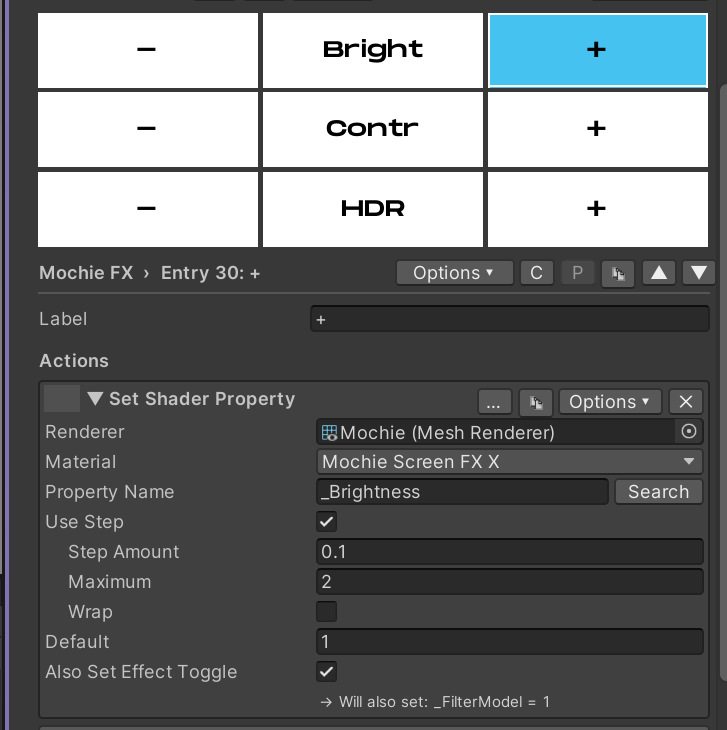
The button in the middle uses a Display action and Custom Color to display the value and provide visual feedback for the step buttons. See Display Actions and Custom Colors.
Custom Colors and Display Actions
The “Custom Color” in the Options menu of each button lets you choose what color the button indicator shows, instead of the button using the default colors in the Settings foldout. Optionally, you can also enable “Conditional” to have the color be controlled by the value of a shader property or udon variable.
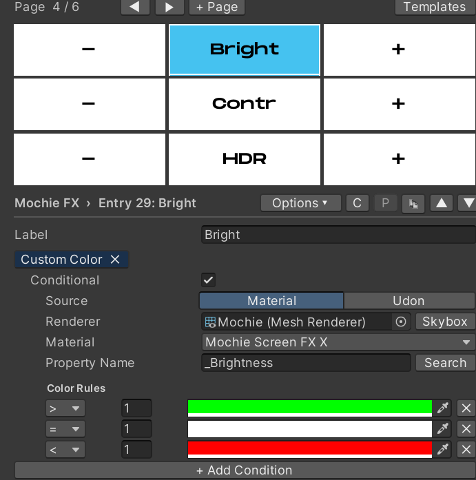
In this example, the button is white (default inactive color) when the value is 0, green when the value is positive, and red when the value is negative.
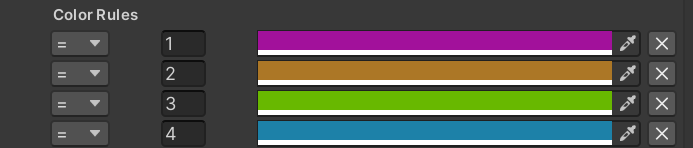
Using this same method, we can also use Custom Color for an AudioLink
band button. Keep in mind that the bands are dependent on the shader
(0-3 for Mochie FX, 1-4 for Bean FX)
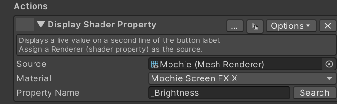
Display actions display a value on the second line of the button that has the action. For example, I am using a “Display Shader Property” action to display the value that is controlled by the step buttons on either side of the “Bright” button.
Color Palettes
Color Palettes allow you to define a set of colors, and then choose which color to apply. For example, in the Mochie FX template we accomplish this using three buttons: Cur Color, Set Color and Nxt Color.
The Set Color action defines the Color Palette. Here you define a name
for the color palette and the colors in the palette. All three buttons
for the palette use this same name, allowing you to make more than one
color palette. The pending color is shown on this button, and on press
it sets the color on the target shader property.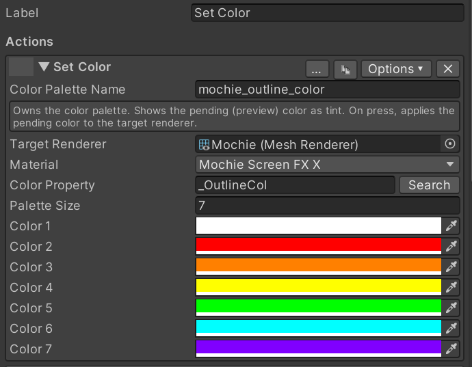
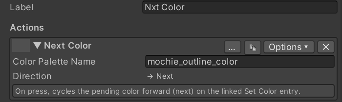
The Next Color action lets you cycle through the colors, changing the pending color. This lets you choose what color you want to apply, then you press the Set Color button to apply it.
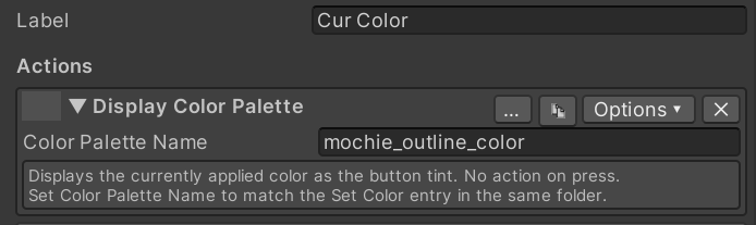
The Cur Color button in my example simply displays the active color. The
active color is what the shader is set to, not the pending color on the
Set Color button.
There is also a Previous Color action if desired.
Exclusivity
Exclusivity allows toggling on a button to disable other buttons with
the same exclusive group. This system is inspired by and works similar
to VRCFury exclusive tags. This is useful in a number of applications,
such as effects that can not both be enabled at the same time.
An example of this is in the Mochie FX template for the Aura Outline and
Sobel Outline buttons. To enable exclusivity, enable “Use Exclusive
Tags” in the Options menu of the button. An “Exclusive Tags” tag should
appear.
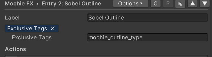
In this example, both Aura Outline and Sobel Outline share the tag “mochie_outline_type”. A button can belong to more than one exclusive group, enter exclusive tags comma delimited. Enabling one of these buttons then disables the other. Only one button in an exclusive group can be enabled at a time. However, all buttons in an exclusive group can be disabled.
If you want one button within a group to always be enabled, such as a group of toggle material action buttons, you can also enable “Exclusive Off” in the Options menu. Whichever button has this tag will be enabled when a button in the exclusive group is disabled. There is also a “Make Folder Exclusive” and “Clear Exclusivity” option to quickly set an entire folder to be exclusive, useful for applications like a Skybox folder.
Variant Groups
Variant Groups work similar to Color Palettes, but instead of defining a
set of colors, you can define a set of values. This lets you configure a
selector for a set of values and choose which to apply, instead of
stepping through values with a step button. Additionally, variant groups
support textures. This is useful for defining a set of textures for
effects like overlays and triplanar effects, which is impossible to do
through step actions.
See Color Palettes for setting this up, the setup is fundamentally
the same.
Variant Groups have not been extensively tested yet, so use at your own risk.
Auto-Changing
Auto-Changing allows Enigma OS to cycle between buttons on a specified interval. An example of this is in the Skybox template.
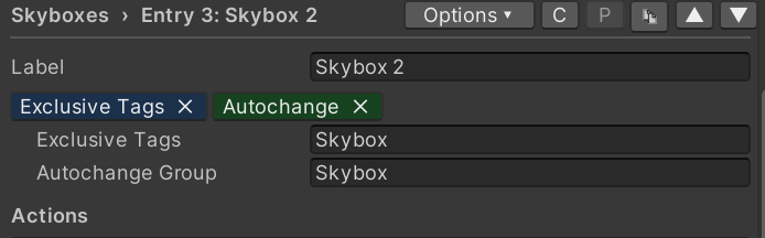
Enter a name for the Autochange group. All buttons you want to be autochanged should share this group name.
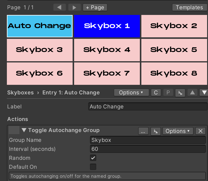
On a separate button, add a “Toggle Autochange Group” action. This action enables or disables auto-changing for the specified group. Set the desired change interval, and whether the auto-changing should be on by default when the controller is initialized. The “Random” checkbox controls if auto-changing picks a random button (besides the currently active one), or if it goes in order as configured in the controller (Skybox 1 -> Skybox 2 -> Skybox 3 for example).
You can make any number of auto-change groups as you desire, just make sure you have separate toggle autochange buttons to control them. Unlike exclusive groups, a button can only be assigned to a single auto-change group.
Expire / Delay / Fade / Conditions
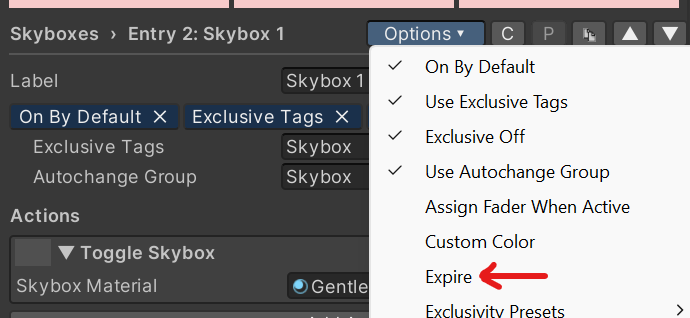
You can configure a button to expire after a certain amount of time. Enable “Expire” in the button’s Options menu. After activating the button, Enigma OS will wait that amount of time and then disable the button.
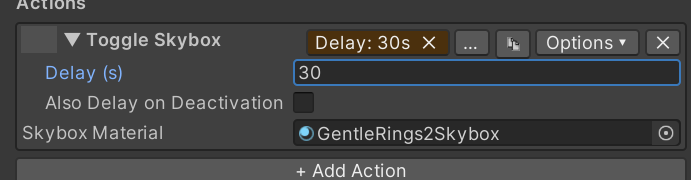
Actions can also be configured to have a delay before they are executed. Each action can have a separate delay, allowing staggered action execution. Optionally you can also have it delay deactivation as well. Enable the “Delay” option in the action’s Options menu and set the wait time in seconds.
Set Shader Property actions (Float, Color, or Vector properties) and Set Udon Variable actions (float and int variables) can fade smoothly to their value instead of snapping. Enable the “Fade” option in the action’s Options menu and set the fade time in seconds. On activation the property fades from its current value to the target value over that time — for example, a toggle setting an outline strength from 0 to 1 with a 3 second fade will fade the outline in over 3 seconds. By default, turning the button off snaps back to the default value immediately; enable “Also Fade on Deactivation” to fade back out over the same time instead (this checkbox only appears on Toggle actions — one-shot Set actions have no deactivation). Fade can be combined with Delay — the fade starts when the delayed action fires.
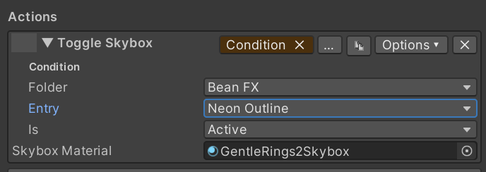
You can also set an action to only execute if a condition is true. This is really just a proof of concept right now. Currently, the only condition possible is the active state of another configured button on the controller. If you have a use case for other conditions, submit a suggestion in the Discord and I can add it.
Using Multiple Enigma OS controllers
Enigma OS supports using multiple controller prefabs in the same scene.
If you’re using multiple controllers for separate purposes, you do not
need any additional setup.
If you want to use two or more controllers for the same purpose, for
example screen shaders in separate areas of your world, or separate
skyboxes in different areas, then you need to add the “Enigma Controller
Boundary” script to a gameobject with a trigger collider, sized around
the area that the controller should be active in. This script re-syncs
the visual state when the local player enters that area and disables
controllers in other areas so the player only receives actions from the
controller in the area of the world they are currently in. You can
optionally disable the disabling behavior.
| ← Using Presets | Whitelist (Access Control) → |